
How Color and Motivation Influences Marketing
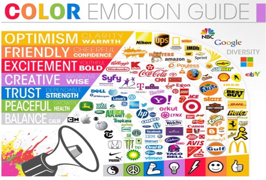
Photo from Casas and Chinoperekweya (2019)
What is color psychology/theory?
Color psychology is the study of how colors influence human behavior, emotions, and perceptions. While often seen as purely aesthetic, color significantly shapes cognitive processes and decision-making. The colors in our environments evoke specific emotional and psychological responses, subtly guiding our actions. These reactions, influenced by personal experiences and cultural contexts, occur both consciously and unconsciously, as we see in marketing and advertising.
Color affects various aspects of life, from taste perception to worker productivity (Bouhassoun et al., 2022). For example, red is linked to appetite and passion, which is why many food brands use red in their logos. This subconscious connection to hunger encourages consumers to buy their products. However, each color has multiple associations; red can also evoke anger, danger, or excitement. While research shows that colors elicit certain reactions, their exact impact is not always predictable.
Current literature suggests that colors influence motivation, either encouraging approach or avoidance behavior (Bouhassoun et al., 2022). For example, red may evoke avoidance due to its association with danger, while blue tends to trigger approach motivation by promoting calmness. Understanding these dynamics helps businesses strategically use color to influence emotional tones, productivity, and behavior.
How Different Cultures Use Color
When it comes to the color red both India and China wear red clothing to weddings as it symbolizes good luck/fortune in those cultures, while Western culture has many different meanings for the color red like love, stop, or danger (Casas & Chinoperekweyi, 2019). At typical weddings in the United States and the United Kingdom, the brides wear white for their weddings. In the Netherlands, the color orange is associated with wealth and represents the Dutch Royal family while in Western and European culture violet has been used as a symbol for royalty due to Royals wearing violet satin fabric throughout history as they were the only ones who could afford it (Casas & Chinoperekweyi, 2019). The color yellow in Germany symbolizes jealousy while in many other cultures, the color green symbolizes jealousy as it is typically referred to as the green monster. In Western culture, green is also associated with luck (St. Patrick's Day) and wealth (dollar bills). How these different colors and their meaning connect to motivation is that in one culture a color can be motivating but in another, it could be the complete opposite. Like with the color orange in the Netherlands symbolizes wealth but Western culture tends to avoid using orange. It is important for marketers to understand how colors meaning differ from culture to culture
Basics Behind Marketing (What Motivates People to Buy Products?)
Branding is fundamentally about creating emotional connections, as we learned while interviewing one of SVSU’s Art Department professors, Joshua Kirby. If we have emotions when seeing colors, and branding is built on the ability to create emotional connections, then color has a crucial role in shaping these connections in marketing. Successful marketing strategies are designed not just to attract attention but to influence consumer perceptions and attitudes, ultimately guiding purchasing decisions. One of the key ways this is achieved is through branding, which is essential for leaving a lasting impression in the consumer's mind (Labrecque & Milne, 2011). A strong brand can offer significant advantages over non-branded or generic products, much like differentiated products stand out from their competitors. By establishing a clear and memorable identity, branding fosters competition and cultivates brand loyalty, ensuring that consumers return to a brand they trust and feel connected to.
Color is one of the most powerful tools in this process. Research shows that colors can profoundly impact how consumers perceive a product, influencing their emotions and even their purchasing choices. A brand can leverage color to create a unique visual identity, helping it stand out in a crowded marketplace. Through consistent use of color, brands can build stronger relationships with their target audience, communicate their values, and differentiate themselves from competitors. The emotional resonance that color carries enhances the overall brand experience, helping businesses forge deeper connections with consumers and ultimately driving brand loyalty.
How Color Affects Marketing
Branding is about emotional connections, as Joshua Kirby from SVSU’s Art Department noted. Since colors evoke emotions, they play a crucial role in creating lasting brand connections. Successful marketing strategies not only attract attention but also influence consumer attitudes and purchasing decisions. A strong brand builds loyalty and stands out from competitors (Labrecque & Milne, 2011). Color enhances this process by creating a unique visual identity that resonates emotionally with consumers, ultimately driving brand loyalty.
Color impacts consumer perception, with certain colors eliciting distinct emotional responses. Red, for instance, is often associated with passion and urgency, while green signals health and trust, though darker shades can have negative associations (Kirby). Age and cultural differences also affect how color is received, requiring marketers to tailor color choices to their target audience.
Studies show that color can directly influence purchasing behavior. The strategic use of color in product design has been shown to significantly affect sales (Dharmananda et al., 2022). However, to effectively leverage color, marketers must understand the psychological and cultural meanings behind colors, aligning them with brand identity to create a memorable and impactful experience.
What Colors are Best for Certain Products (Food, Clothes, etc.)
Color is a power communicator of brand personality that has to be calibrated to a business’s target audience. For fast food brands, the vibrant combination of red and yellow is often the go-to, as stated by Kirby. Red is associated with passion and appetite, making it an ideal choice for food-related products. It evokes excitement and stimulation (Labrecque & Milne, 2011), which can lead to increased consumer desire and quick decision-making. Yellow, on the other hand, radiates positivity and optimism, appealing to younger audiences and encouraging social interactions. Together, these colors stimulate appetite and create an energetic, welcoming atmosphere in the fast-food industry.
When it comes to more serious industries such as banking, colors that promote trust and stability, which would be blue and green, are particularly effective. Blue, associated with competence, intelligence, and security (Labrecque & Milne, 2011), is the perfect choice for institutions that want to project reliability and professionalism. Green, often linked to nature and environmental friendliness (Labrecque & Milne, 2011), communicates peacefulness and stability. Both colors work together to convey a sense of trust and long-term security, crucial for brands in the financial sector.
As identified by Labrecque and Milne in 2011, and then also stated by Kirby, casual or earthy designs, especially brown and blue are ideal colors for clothing. Brown represents reliability, support, and tradition, making it perfect for brands that want to emphasize dependability and groundedness. Blue, particularly in darker tones, conveys professionalism and trustworthiness, while lighter blues can evoke calmness and serenity. Together, these colors balance sophistication with warmth and practicality, which is why they’re commonly used in everything from denim to tailored suits.
When promoting health and wellness products, green is often the go-to color, particularly lighter shades. Light green is strongly associated with health, vitality, and nature (Labrecque & Milne, 2011). It communicates a sense of well-being, growth, and organic quality, making it a perfect choice for brands that focus on natural or sustainable products. Whether you're selling organic skincare or eco-friendly supplements, light green resonates with consumers looking for purity and health-conscious options. Additionally, Kirby mentioned that many hospitals utilize the color, due to its association with health.
The right color choice should always align with both your target demographic and the desired brand personality. For instance, gender-specific products, children's items, or products aimed at different cultures may require tailored color schemes to ensure they connect with the audience on a deeper, more emotional level (Dharmananda et al., 2022).
The colors you choose are an extension of your brand's personality, shaping how consumers perceive your products and values. By understanding the psychological associations behind different colors, you can craft a brand identity that resonates with your audience, builds trust, and drives action.
Colors to Avoid in Marketing
While colors have the power to evoke strong emotions and influence consumer behavior, some shades may be best avoided depending on the context of your brand and your target audience. Understanding which colors to steer clear of—and why—is just as important as knowing which hues to embrace.
While there is no specific color that absolutely must be avoided when it comes to branding and logos, Kirby informed us that one color that companies tend to refrain from using is white. Often associated with purity and simplicity, the color white is generally not used in logo design for one main reason: it lacks emotional depth. In the world of marketing, where brands seek to create strong, lasting impressions, white can come across as too plain or sterile, leaving little room for connection. It’s clean and minimalist, but it might not have the components needed to promote engagement or excitement. While white works well in some contexts, like brands that emphasize elegance or cleanliness, it's rarely the dominant color in successful logos.
Kirby also identified a second color that is not exactly the most “popularly” used. Green is typically avoided in logos, though it can work well in specific industries, as previously discussed, such as banking or healthcare. Although commonly associated with health, nature, and sustainability, not all shades of green are desirable in marketing. For instance, darker or muddier greens, like the shade of mold, can evoke feelings of uncleanliness, which could negatively impact a brand’s image. That’s why many companies shy away from green unless they’re in industries where it has a more positive connotation, such as organic food brands or environmentally conscious companies.
As with positive associations, negative color associations can vary greatly across cultures, so it's crucial to consider how your brand’s color palette will be received in different regions. Similarly, colors that work well in one culture may not have the same impact—or could even carry negative connotations—in another. For example, while white symbolizes purity and innocence in many Western cultures, it carries a very different meaning in parts of Asia, where it’s often associated with mourning and funerals. To avoid unintended cultural missteps, market research is essential when choosing your brand’s colors. Understanding the emotional and cultural meanings behind different hues ensures that your color choices are appropriate for your target demographic (Dharmananda et al., 2022).

Photo from HSB - Hue Saturation & Brightness (2019)
Shade/Hue/Intensity of Colors in Marketing
When it comes to marketing, the task of choosing colors isn't just about choosing a palette; it’s about using hue, saturation, and luminance to craft the exact emotional experience you want your brand to evoke. Every detail of a color’s intensity and brightness plays a role in shaping consumer perceptions and how your brand is experienced. Understanding these nuances is key to developing a strong, consistent brand identity that resonates with your target audience.
Hue is essentially the basic color; the fundamental shade that defines what color a brand is using. Whether it’s red, blue, yellow, or green, the hue sets the tone and communicates the primary mood of your brand. For example, a bold red hue might signal excitement and passion, while a soft blue hue could invoke feelings of trust and reliability.
Saturation, also referred to as intensity, describes how vivid or pure a color is. A highly saturated color is intense and eye-catching, often used to create a “shocking or energetic” experience. Bright and saturated colors can stimulate excitement, grab attention, and inject energy into your brand. When you think of the neon tones, you may reflect on the idea that they’re often used in fast food chains, tech gadgets, or youth-focused products; they’re bold, they stand out, and they create a sense of urgency or playfulness, which is what the companies want.
On the other hand, less saturated colors, or colors that are more muted and toned down, tend to have a calming effect. These colors convey a sense of security, trust, and stability, which is why they’re often used by brands that want to project reliability or create a sense of safety, like healthcare companies or financial institutions.
Luminance refers to how light or dark a color is. A color with higher luminance will appear brighter, often making it feel more energetic and engaging. For instance, light, pastel shades are often used to convey a gentle, friendly vibe, which works well for children's products or brands targeting a youthful audience. As mentioned by Kirby, these brighter, lighter shades are also often seen as “candy-like colors, and are particularly appealing to children.” In contrast, darker colors with lower luminance tend to evoke more serious, sophisticated feelings. When thinking of luxury brands and professional services, darker shades of blues, blacks, and grays tend to be used as they often convey feelings of competence, authority, and exclusivity.
Hue alone isn't enough to communicate your brand's personality; how saturated or intense a color is, and how light or dark it appears, can dramatically influence the perception of your brand. Brands can manipulate these elements to refine their image, even when they are using a single hue. For example, a brand might use a deep, muted red to evoke sophistication and luxury, or a bright, vivid red to create excitement and urgency. The key is to find the right balance of saturation and value to ensure that the color fits the brand's desired identity. Whether a company is aiming for bold and energetic or calm and stable, by carefully selecting and making subtle adjustments to these color properties brand can intentionally change how their audience engages with their products (Labrecque & Milne, 2011).
What Makes a Good Logo?
A strong logo is a key element in brand identity; creating a great logo is about more than just picking a cool shape or color. It’s about crafting a visual identity that communicates your brand’s personality, values, and message in a way that is both memorable and versatile. Simplicity, limited color use, and compactness are key, but the real magic happens when a logo also plays on the psychological reward response, triggering a deeper connection with the audience. A good logo is one that doesn’t just stand out; it sticks with you, becoming a symbol of trust, recognition, and familiarity.
One of the most important principles of logo design is simplicity. A logo should be easy to recognize and reproduce, even at small sizes. Kirby stated that complex, heavily detailed logos, while visually striking, can become distracting and lose their clarity, especially when scaled down. For example, a logo with intricate line work or too many shapes can turn into a “scribble” when reduced to fit on something small, like a business card. On the other hand, simplicity doesn’t mean bland. A logo that is too simple can be forgettable, failing to make a strong impression. The key is finding the right balance; something concise, clean, and distinctive, without overloading the viewer with unnecessary details.
A general rule of thumb when it comes to logos is that less is more. Effective logos typically use no more than two colors. This helps maintain clarity and makes the logo more versatile. In fact, a good logo should still be effective when reproduced in just one color, ensuring that it maintains its integrity regardless of the medium. The right combination of shape and color plays a significant role in shaping brand perceptions. A well-chosen color can communicate much about a brand’s personality, and this connection between color and brand identity is why color should be strategically selected to evoke the desired emotional response from your audience (Labrecque & Milne, 2011).
Building off the “simplicity” rule, the more compact and concise a logo is, the better. Logos that are easy to scale, versatile, and adaptable across various platforms tend to stand out in a crowded marketplace. A compact design is easier to recognize at a glance, whether it’s on a website, a billboard, or a mobile app icon. The simpler and more streamlined a logo, the easier it is to translate across different mediums without losing its integrity. A strong logo combines visual elements, particularly shape and color, that effectively communicate the brand’s personality and core message (Labrecque & Milne, 2011). For example, logos with geometric shapes or clean lines often convey professionalism, reliability, and efficiency, while organic shapes might communicate friendliness, approachability, or sustainability.
A well-designed logo doesn't just look appealing; it also provides a sense of satisfaction when its meaning clicks with the viewer. This is where the psychology of logo design plays a crucial role. Logos that are simple yet rich in meaning trigger a positive emotional response, engaging the brain’s reward system. When different elements of a logo align seamlessly, especially with multiple layers of significance, viewers experience a deeper connection. As Kirby explains, logos that create a psychological "click" when the audience recognizes and understands the layered meanings, are the ones that leave a lasting impression. One of his favorite examples is the Amazon logo. The arrow beneath the company name resembles a smile, evoking the feeling of joy when receiving a package. But there's another clever aspect: the arrow starts at the "a" and ends at the "z," symbolizing that Amazon offers everything from A to Z. This combination of visual cues and layered meaning makes the logo both memorable and impactful.
Concluding Remarks
In summary, color is not just an aesthetic choice—it's a powerful, psychological tool that shapes how we interact with the world and make decisions. By leveraging color effectively, brands can enhance their visual identity, engage consumers on a deeper emotional level, and drive success in the marketplace. Beyond its appearance, color influences perceptions, behaviors, and cultural associations, which can strengthen or weaken a brand’s position.
Whether using red to evoke excitement, blue to promote trust, or green to signal health, colors resonate with consumers on both conscious and subconscious levels. Understanding the cultural and psychological meanings behind different colors is crucial for ensuring that a brand's message is received as intended.
By aligning color choices with a brand’s values and emotional goals, companies can create a more cohesive and impactful brand experience. Color is a subtle yet powerful communicator that fosters trust, recognition, and loyalty, making it a critical tool in branding and marketing. Ultimately, mastering color psychology allows brands to influence consumer perceptions, create lasting connections, and stand out in a competitive marketplace.
► Listen to our podcast episode!References